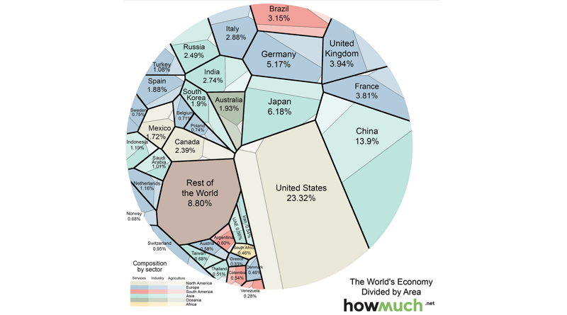
Here is an infographic showing an unorthodox depiction of the world economy. Each country represented in the graphic is divided by manufacturing, services and agriculture.
Here is some interesting information revealed by the graphic.
- For example, compare the US and China. The US economy is much larger than China, but the first industrial sectors are comparable in size, and China’s agriculture sector looks to be a little bit larger. Services are what drive the entire gap.
- The UK and France have similarly sized overall economies, but agriculture is a much bigger slice of the French pie.
- Although Russia is often viewed as a superpower and a potential global menace, its economy produces less than that of Italy.
- You often hear the phrase “China and India,” but you can see here that the two Asian giants are in very different shape economically.
- The only African nation on this list, South Africa, has a smaller economy than Colombia.


